Request Information
Ready to find out what MSU Denver can do for you? We’ve got you covered.
University programs reside within University departments. This applies to both academic and university-support programs.
For visual consistency, a brand-identity system is established to easily construct University-approved logos as new departments and programs become officially offered through the University.
To obtain University-approved logo artwork for your respective department or program, contact University Communications and Marketing.
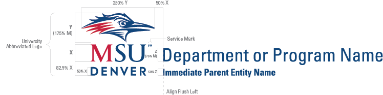
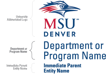
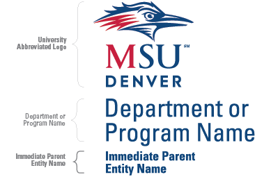
Department and their Immediate Parent Entity names are placed to the right of the Abbreviated logo. For lengthy Department/Program names, the name may break naturally between words on two or more lines, keeping optimal readability in mind. The diagram below indicates the size and spatial relationship of the logo components.
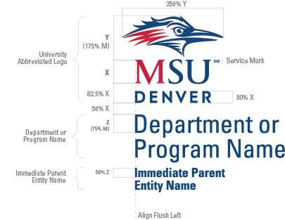
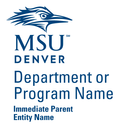
Department and Parent Entity names are placed below the Abbreviated logo. For lengthy Department/Program names, the name may break naturally between words on two or more lines, keeping optimal readability in mind. The diagram below indicates the size and spatial relationship of the logo components.
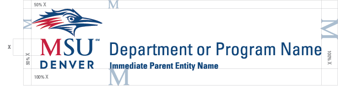
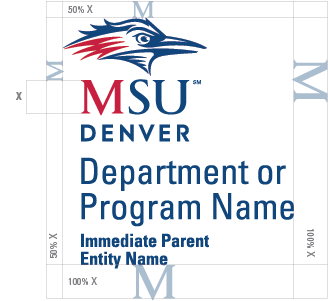
A “clear zone” is the minimum amount of space to remain free of other imagery such as text, photography, illustrations, color breaks or rule lines. This minimum space requirement also applies to page trim and folds.
The clear zone for MSU Denver Department/Program logos is proportional to the size of the logo. Its border is determined by measuring from the outer edges of the logo to the distances indicated in the diagrams below.
Adhering to clear zone guidelines will best ensure legal protection of our logos by minimizing confusion as to their appearances.
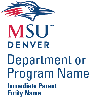
The three main components of the department logos are:
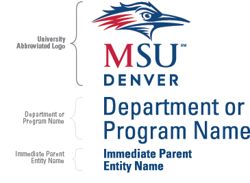 University Abbreviated Logo
 Immediate Parent Entity Name Details:
Shown below is the minimum approved size for our Department/Program logos as measured from the width of the Roadrunner Symbol. If a size smaller than the approved is necessary, the Department/Program name is typeset in one of the approved support typefaces. See supported typefaces for more information under “Brand Typography”.
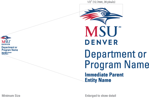
Minimum size: ½ inch (12.7mm, 36 pixels) as measured from the width of the Roadrunner Symbol.
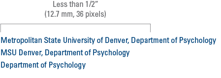
Using Department of Psychology as the example, these are acceptable derivatives of our academic department or program names.
 If the display area does not permit sufficient logo sizing, you may display the Department/Program name in upper and lowercase or in all caps. It must be typeset in one color in one of the typefaces from our approved type families: Univers, Gotham or Century Schoolbook. Contact University Communications and Marketing for approval of any typeface substitutions.
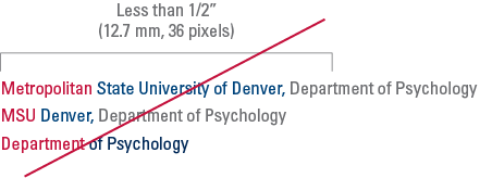
DO NOT display the Department/Program name in a two- or three-color solution to mimic the appearance of the academic department or program logo.
When mentioning Department/Program names in text, the University name will precede the Department/Program name separated by a comma in methods dependent upon the anticipated audience. For example:
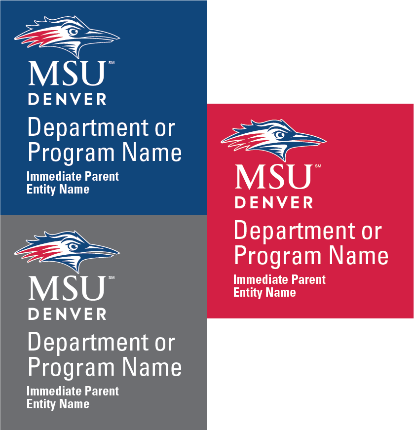
Our Department/Program logos consist of specific hues of blue, red and gray. Accurate reproduction of these colors, referred to as MSU Denver Blue, MSU Denver Red and MSU Denver Gray, is critical to maintaining a consistent brand image. See Brand Colors for specific color formulas per media.
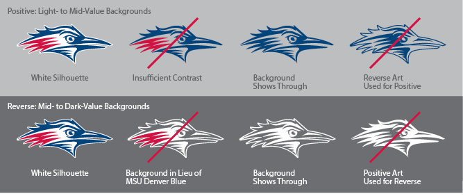
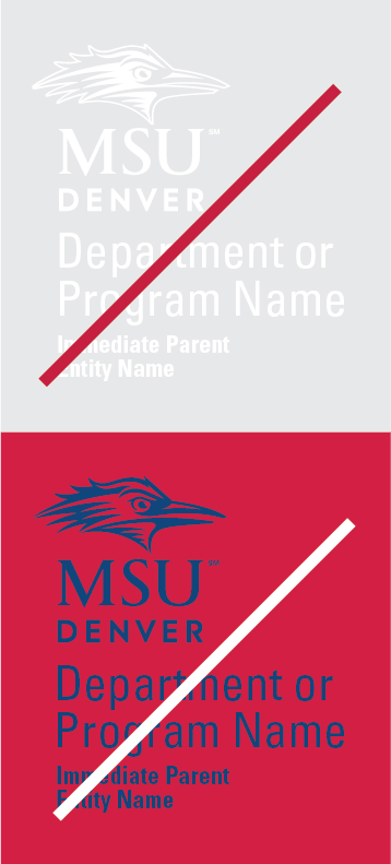
When a Department/Program logo is darker than the background color on which it is displayed, it is referred to as “positive.” When the logo is lighter than the background color on which it is displayed, it is referred to as “reverse.” Within these two categories, there are both full-color and one-color options from which you may choose. The full-color options are preferred and should be displayed wherever practical. See Color Selection to determine the most appropriate logo color option for its intended display.
Full-Color – Preferred
Display on:
One-Color – Preferred
Display on:
One-Color – Approved
Display on:

Full-Color – Preferred
Display on:
One-Color – Preferred
Display on:
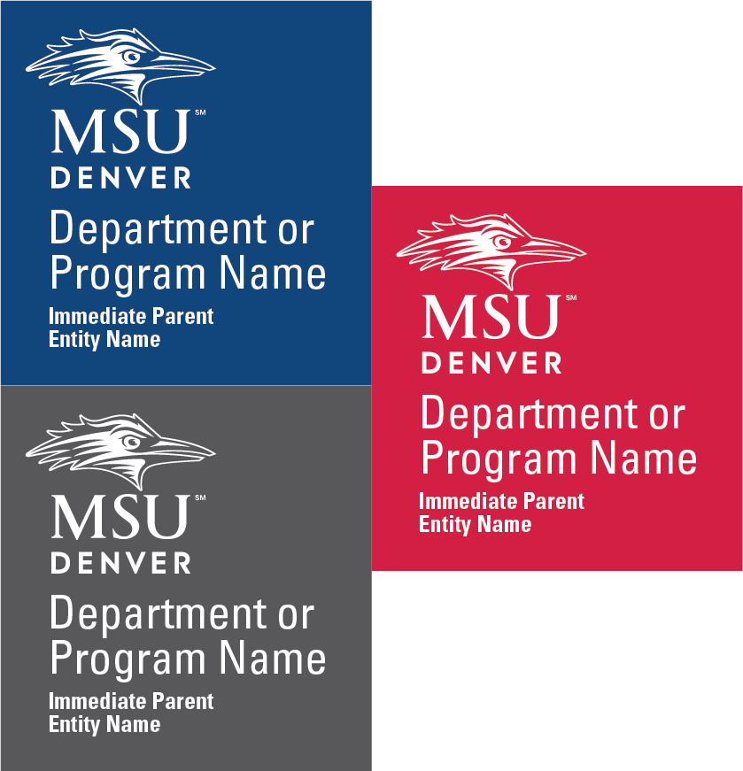
One-Color – Approved
Display on:
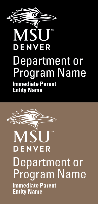
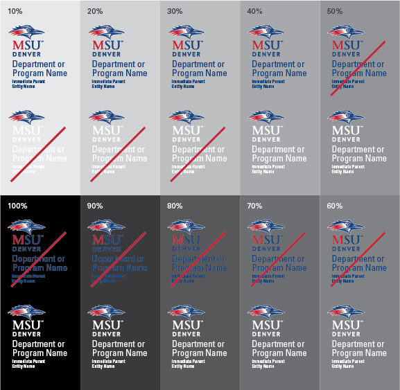
Clear logo visibility is important for ensuring its integrity and the professional reputation of the University. All logo components must be easily discernible from the background on which they are displayed. The grayscale diagram below demonstrates how the visibility of each logo color option is affected by the color value of its background. Additionally, avoid displaying the logo on background areas with a high degree of distracting visual activity. Generally, positive logos provide optimum contrast on light- to medium-value backgrounds and reverse logos provide optimum contrast on medium- to dark-value backgrounds.
To best ensure clear legibility and maintain brand integrity, it is important to select the correct color version of any of our logos that include the Roadrunner Symbol. To this point, there are two important design features:
Preserving the integrity of the MSU Denver brand is paramount. A visible method of preservation is through accurate and consistent display of our University Support entity logos. This practice will help reinforce its strength and continue to grow MSU Denver’s current degree of brand equity.
Shown below are just a few of potential misuses of our Department/Program logos. All attempts should be made to adhere to the guidelines stated in this document. Any misuse will ultimately diminish the current degree of brand equity and potentially jeopardize its legal protection.
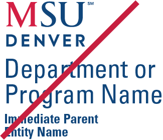
Below is the approved and preferred appearance of our Department/Program Logos:
Below are just a few potential misuses of our logo. Avoid these misuses and others. If you have questions regarding correct logo use, contact University Communications and Marketing.
DO NOT: Transpose the color scheme. Display only the approved color options.
DO NOT: Create a one-color version with tints to simulate the hue differences found within the full-color version.
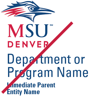
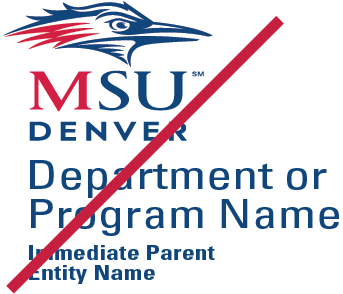
 DO NOT: Allow poor visibility between the logo and its background.
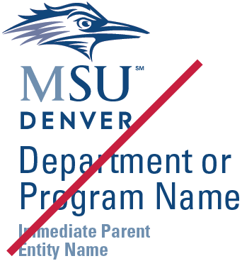
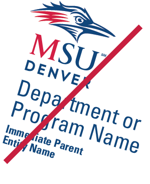
 DO NOT: Horizontally stretch the logo to fit within specific display areas. Always use one of the three approved format options.
 DO NOT: Display the logotype components as a stand-alone graphic. The logo must appear intact with Roadrunner Symbol, Logotype, Department name, and optional College name locked together.
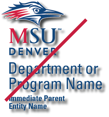 DO NOT: Create special effects with the logo. Effects such as drop shadows impede legibility and diminish the logo’s integrity.
 DO NOT: Display a one-color version other than those approved.
 DO NOT: Allow the letter “M” to appear in MSU Denver Red (as it does in positive logo art) on reverse applications. Always ensure the logotype appears in white on reverse applications.
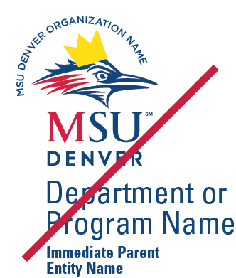
DO NOT: Add graphics to the logo. Always ensure the Clear Zone is properly observed.
 DO NOT: Vertically stretch the logo in an attempt to fit within specific display areas. Always use one of the three approved format options.
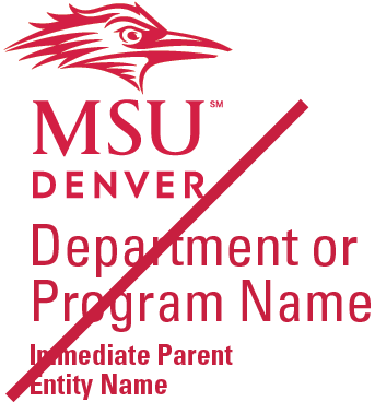
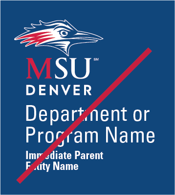
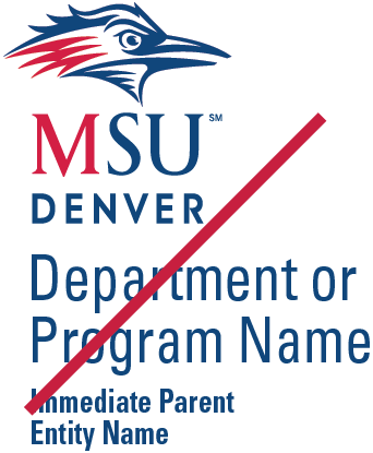
 DO NOT: Typeset the Department name in a typeface other than the approved Univers 57 Condensed or optional College name in a typeface other than the approved Univers 67 Bold Condensed.
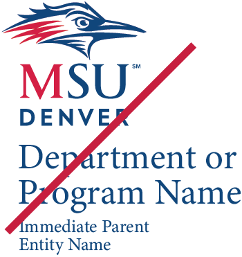
 DO NOT: Rotate the logo or any of its parts.
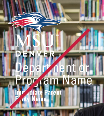
DO NOT: Place the logo on a busy, complicated or high-contrast background. Such placement makes the logo hard to read.