Request Information
Ready to find out what MSU Denver can do for you? We’ve got you covered.
By featuring the college or school name prominently within the logo composition, each College/School is able to better market itself and its respective departments and programs. This level allows a focus on the College/School while maintaining the connection to the University identity. To obtain University-approved logo artwork for your respective college or school, contact University Communications and Marketing.
When to use
Display college-entity logos on marketing collateral that represent the college as a whole. For department- or program-specific collateral, it is preferred to display the department (or program) logo, which displays the department name in a fixed relationship to the University logo, so as to maintain a strong tie back to the overall University.
Mentioning in text
When mentioning in text and on first reference in applications whose intended audiences may not already be familiar with the University, the University’s full name precedes the college’s (or school’s) full name. A comma separates the two. For example: “Metropolitan State University of Denver, College of Letters, Arts and Sciences” The abbreviated “MSU Denver, College of Letters, Arts and Sciences” may be used on first reference in applications whose intended audiences are likely to already be familiar with the University. Subsequent references within the same application for either first-reference scenario may omit the University prefix and simply use the college name, “College of Letters, Arts and Sciences” or its acronym “LAS.”
The logo components are in a fixed size and spatial relationship to one another. There are two formats available for use: horizontal and vertical (vertical shown). Do not resize or reposition the components within the logo. Additionally, the college (or school) name is displayed in a custom-rendered typeface. Do not typeset the college name in an attempt to re-create the logo.
Using MSU Denver, College of Letters, Arts and Sciences as an example, these guidelines apply to each college-entity logo.
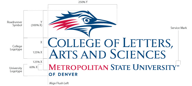
This provides optimal logo display within the space provided per application. The components within these formats are in a fixed size and spatial relation to one another and should not be altered.
Using MSU Denver, College of Letters, Arts and Sciences as an example, these guidelines apply to each college-entity logo.


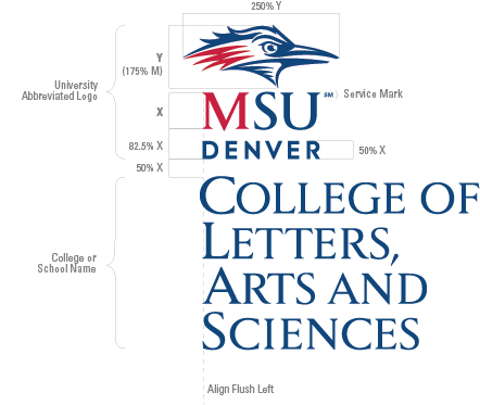
The two main components of the college/school logos are:
 University Abbreviated Logo
Click here for more details about the MSU Denver Abbreviated Logo.
 College/School Name Details:
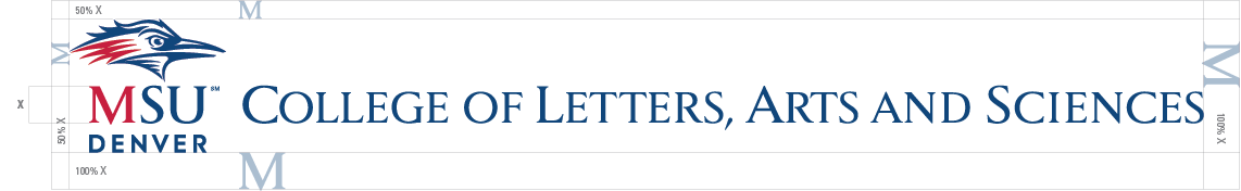
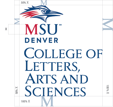
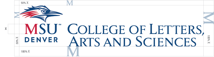
A “clear zone” is the minimum amount of space to remain free of other imagery such as text, photography, illustrations, color breaks or rule lines. This minimum space requirement also applies to page trim and folds.
The clear zone for MSU Denver College/School logos is proportional to the size of the logo. Its border is determined by measuring from the outer edges of the logo to the distances indicated in the diagrams below.
Adhering to clear zone guidelines will best ensure legal protection of our logos by minimizing confusion as to their appearances.
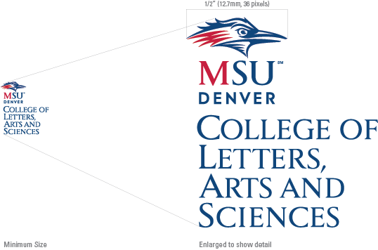
Shown below is the minimum approved size for our College/School logos as measured from the width of the Roadrunner Symbol. If a size smaller than the approved is necessary, the academic department or program name is typeset in one of the approved support typefaces. See Support Typefaces.
Minimum size: ½ inch (12.7mm, 36 pixels) as measured from the width of the Roadrunner Symbol.
 If the display area does not permit sufficient logo sizing, you may display the College/School name in upper and lowercase or in all caps. It must be typeset in one color in one of the typefaces from our approved type families: Univers, Gotham or Century Schoolbook. Contact University Communications and Marketing for approval of any typeface substitutions.
DO NOT display the college-entity name in a two- or three-color solution in an effort to mimic the appearance of the college-entity logo.
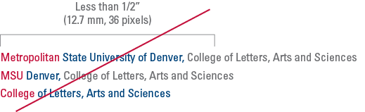
When mentioning college/school names in text, the University name will precede the College/School name separated by a comma in methods dependent upon the anticipated audience. For example:
Our College/School logos consist of specific hues of blue, red and gray. Accurate reproduction of these colors, referred to as MSU Denver Blue, MSU Denver Red and MSU Denver Gray, is critical to maintaining a consistent brand image. See Brand Colors for each color’s specific color formulas per media.
When a College/School logo is darker than the background color on which it is displayed, it is referred to as “positive.” When the logo is lighter than the background color on which it is displayed, it is referred to as “reverse.” Within these two categories, there are both full-color and one-color options from which you may choose. The full-color options are preferred and should be displayed wherever practical. See Color Selection below for more details.
Display on:
![]()
One Color – Preferred
Display on:

One Color – Approved
Display on:

Full-Color – Preferred
Display on:

One-Color – Preferred
Display on:

Display on:

One Color – Approved
Display on:

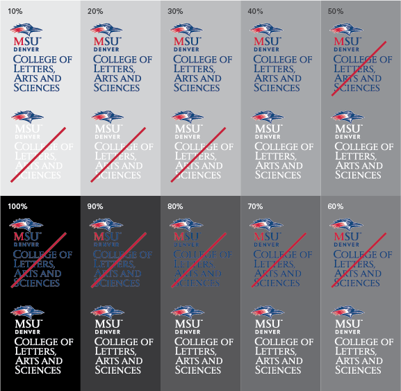
Clear logo visibility is important for ensuring its integrity and the professional reputation of the University. All logo components must be easily discernible from the background on which they are displayed. The grayscale diagram below demonstrates how the visibility of each logo color option is affected by the color value of its background. Additionally, avoid displaying the logo on background areas with a high degree of distracting visual activity. Generally, positive logos provide optimum contrast on light- to medium-value backgrounds and reverse logos provide optimum contrast on medium- to dark-value backgrounds.
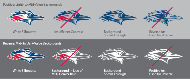
To best ensure clear legibility and maintain brand integrity, it is important to select the correct color version of any of our logos that include the Roadrunner Symbol. To this point, there are two important design features:
 Preserving the integrity of the MSU Denver brand is paramount. A visible method of preservation is through accurate and consistent display of our University Support entity logos. This practice will help reinforce its strength and continue to grow MSU Denver’s current degree of brand equity.
At left is the approved and preferred appearance of our College/School logos.
Shown below are just a few of potential misuses of our College/School logos. All attempts should be made to adhere to the guidelines stated in this document. Any misuse will ultimately diminish the current degree of brand equity and potentially jeopardize its legal protection. If you have questions regarding correct logo use, contact University Communications and Marketing.
![]() DO NOT: Transpose the color scheme. Display only the approved color options
DO NOT: Transpose the color scheme. Display only the approved color options
![]()
DO NOT: Create a one-color version with tints to simulate the hue differences found within the full-color version.
![]() DO NOT: Allow poor visibility between the logo and its background.
DO NOT: Allow poor visibility between the logo and its background.
![]() DO NOT: Horizontally stretch the logo to fit within specific display areas. Always use one of the three approved format options.
DO NOT: Horizontally stretch the logo to fit within specific display areas. Always use one of the three approved format options.
![]() DO NOT: Display the logotype components as a stand-alone graphic. The logo must appear intact with Roadrunner Symbol, Logotype, and College/School name locked together.
DO NOT: Display the logotype components as a stand-alone graphic. The logo must appear intact with Roadrunner Symbol, Logotype, and College/School name locked together.
![]() DO NOT: Create special effects with the logo. Effects such as drop shadows impede legibility and diminish the logo’s integrity.
DO NOT: Create special effects with the logo. Effects such as drop shadows impede legibility and diminish the logo’s integrity.
![]() DO NOT: Create new logo formats. Only display the approved formats.
DO NOT: Create new logo formats. Only display the approved formats.
![]() DO NOT: Display a one-color version other than those approved.
DO NOT: Display a one-color version other than those approved.
![]() DO NOT: Allow the letter “M” to appear in MSU Denver Red (as it does in positive logo art) on reverse applications. Always ensure the logotype appears in white on reverse applications.
DO NOT: Allow the letter “M” to appear in MSU Denver Red (as it does in positive logo art) on reverse applications. Always ensure the logotype appears in white on reverse applications.
![]()
DO NOT: Add graphics to the logo. Always ensure the Clear Zone is properly observed.
![]() DO NOT: Vertically stretch the logo in an attempt to fit within specific display areas. Always use one of the three approved format options.
DO NOT: Vertically stretch the logo in an attempt to fit within specific display areas. Always use one of the three approved format options.
![]() DO NOT: Typeset the College/School name in a typeface other than the approved custom MSU Denver typeface.
DO NOT: Typeset the College/School name in a typeface other than the approved custom MSU Denver typeface.
![]() DO NOT: Rotate the logo or any of its parts.
DO NOT: Rotate the logo or any of its parts.
![]()
DO NOT: Place the logo on a busy, complicated or high-contrast background. Such placement makes the logo hard to read.