Request Information
Ready to find out what MSU Denver can do for you? We’ve got you covered.
Our University logo embodies the essence of our core values. From students, to faculty and staff and how we represent ourselves to our external audiences, the MSU Denver brand stands for diversity, tenacity and inclusivity, each with an entrepreneurial spirit. The Roadrunner Symbol (see University Roadrunner History) alludes to the University’s humble beginnings, when students and faculty had to traverse the streets of downtown Denver, dodging traffic, to attend classes located in multiple buildings. The University adopted “Roadrunners” as its mascot in 1977, and today’s Roadrunner Symbol pays homage to the University’s history and its spirit of tenacity.
The University logo should be displayed on collateral that represents the University as a whole. Additionally, any touchpoint whose intended audiences are those not likely to already be familiar with the University should display this full-name brand identity.
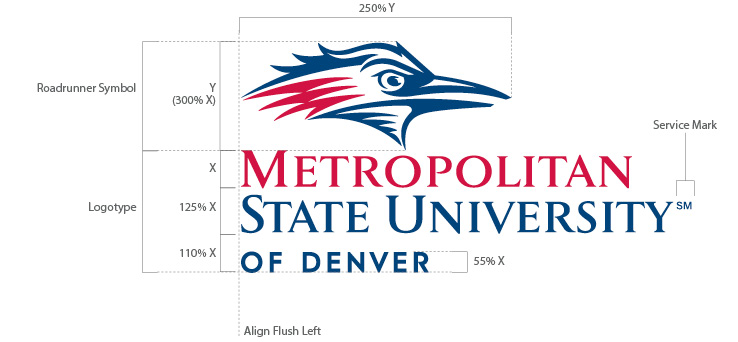
The diagram below identifies the various components of our University logo. Each component is named for reference ease. These components are in a fixed size and spatial relation to one another and should not be altered.
Our University logo is available in three formats. This provides optimal logo display within the space provided per application. The components within these formats are in a fixed size and spatial relation to one another and should not be altered. The vertical format is preferred and should be displayed wherever practical, provided that the available display area permits sufficient size for the logo.

Format A is the preferred format and should be displayed wherever practical. Additionally, format A best fits applications with square to vertically proportioned display areas.

Display Format B on applications with horizontally proportioned display areas.
![]()
Display Format C on applications with extreme horizontally proportioned display areas.
To avoid crowding our logos with other imagery – such as text, photography, illustrations, color breaks or rule lines – a “clear zone” is the minimum amount of space to remain free of other imagery. This minimum space requirement also applies to page trim and folds. The clear zone is proportional to the size of the logo, and its border is determined by measuring from the outer edges of the logo to the distances indicated in the diagrams below.
Adhering to clear-zone guidelines will best ensure legal protection of our logos by minimizing confusion as to their appearances.
![]()
![]()
![]()
Our University logo is available in three formats. This provides optimal logo display within the space provided per application. The components within these formats are in a fixed size and spatial relation to one another and should not be altered. The vertical format is preferred and should be displayed wherever practical, provided that the available display area permits sufficient size for the logo.
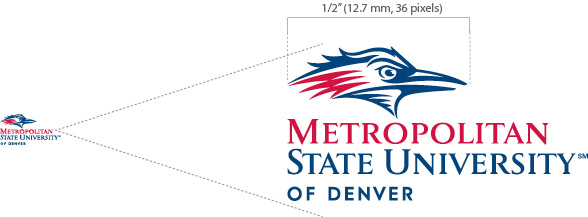
The minimum size to be displayed is 1 half-inch (12.7mm, 36 pixels) as measured from the width of the Roadrunner Symbol.

If a visual representation of the University is needed but the display area does not permit sufficient logo sizing, you may display the University name in upper- and lowercase, or in all caps. It must be typeset in one of the typefaces from our approved type families, Univers, Gotham or Century Schoolbook, and must appear in one color. Contact University Communications and Marketing for approval of any typeface substitutions.
DO NOT display the University name in a two-color solution in an effort to mimic the appearance of the University logo.
Our University logo consists of specific hues of blue and red. Accurate reproduction of these colors, referred to as MSU Denver Blue and MSU Denver Red, is critical to maintaining a consistent brand image. See Brand Colors for their specific color formulas per media.
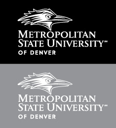
When the University logo is darker than the background color on which it is displayed, it is referred to as “positive.” When the logo is lighter than the background color on which it is displayed, it is referred to as “reverse.” Within these two categories, there are full-color and one-color options from which you may choose. The preference is to display the full-color version wherever practical. Often, only one color is permitted or practical. In these instances, the preference is to display the one-color version that utilizes MSU Denver background colors. If this is not a practical option, then the one-color black on any light- to mid-value background (or white on any mid- to dark-value background) is approved. See Color Selection to determine the most appropriate logo color option for its intended display.
Display on white or light- to mid-value backgrounds:
Full Color – Preferred
 MSU Denver Blue
Display on:
One Color – Preferred
 MSU Denver Blue
Display on:
One Color – Approved
 Black (shown)
Display on:
Display on black or mid-to-dark value backgrounds:
Full Color – Preferred
 MSU Denver Blue
Display on:
One Color – Preferred
 White
WhiteDisplay on:
One Color – Approved
White
Display on:
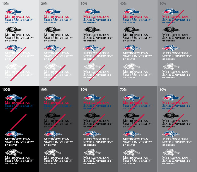
Clear logo visibility is important for ensuring its integrity. All University logo components must be easily discernible from the background on which they are displayed. The gray-scale diagram below demonstrates how the visibility of each logo color option is affected by the color value of its background. Additionally, avoid displaying the logo on background areas with a high degree of contrast and/or distracting visual activity. Generally, positive logos provide optimum contrast on light- to medium-value backgrounds and reverse logos provide optimum contrast on medium- to dark-value backgrounds.
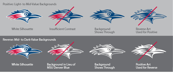
To best ensure clear legibility and maintain brand integrity, it is important to select the correct color version of any of our logos that include the Roadrunner Symbol. To this point, there are two important design features:
1) The Roadrunner Symbol artwork is available with and without a white silhouette behind the symbol. The white silhouette ensures clear legibility regardless of the background color value on which it is displayed. However, the white silhouette is not always practical in certain reproduction techniques. In scenarios such as small imprint or two-color reproduction limitations on colored backgrounds, it is preferred to use a one-color logo to avoid diminished visibility of the red logo components caused by close color boundary between the red components and the background.
2) When selecting a one-color logo, be sure to select the one-color positive art for light- to mid-value backgrounds and the one-color reverse art for mid- to dark-value backgrounds. These two one-color versions are NOT interchangeable. The rendering of the Roadrunner Symbol is different between the positive and reverse versions so that the eye “reads correctly.” If the one-color positive logo is inadvertently displayed in white on a dark-value background, it will appear incorrect because of the misread of the eye. Likewise, displaying a one-color reverse logo in MSU Denver Blue or black on a light-value background will result in the same undesirable effect.
Preserving the integrity of the MSU Denver brand is paramount. A visible method of preservation is through accurate and consistent display of our University logo. This practice will help reinforce its strength and continue to grow MSU Denver’s current degree of brand equity.
Shown below are just a few potential misuses of our University logo. All attempts should be made to adhere to the guidelines stated in this document. Any misuse will ultimately diminish the current degree of brand equity and potentially jeopardize its legal protection.
 At right is the approved and preferred appearance of our University logo.
Avoid the logo misuses below and others. If you have questions regarding correct logo use, contact University Marketing and Communications.
![]() DO NOT:
DO NOT:
Transpose the color scheme. Only display the approved color options.
 DO NOT:
Display a one-color version other than those approved.
 DO NOT:
Create a one-color version with tints to simulate the hue differences found within the two-color version.
 DO NOT:
Allow “Metropolitan” to appear in MSU Denver Red (as it does in positive logo art) on reverse applications. Always ensure the logotype appears in white on reverse applications.
 DO NOT:
Allow poor visibility between the logo and its background.
 DO NOT:
Add graphics to the logo. Always ensure the Clear Zone is properly observed.
 DO NOT:
Create new logo formats. Only display the approved formats.
 DO NOT:
Horizontally stretch the logo in an attempt to fit within specific display areas. Always use one of the three approved format options.
 DO NOT:
Vertically stretch the logo in an attempt to fit within specific display areas. Always use one of the three approved format options.
 DO NOT:
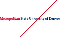
Display the logotype component as a stand-alone graphic. The logo must appear intact with both the Roadrunner Symbol and logotype together.
 DO NOT:
Typeset the logotype in an attempt to simulate it. The logotype is custom-rendered and should not be altered.
 DO NOT:
Create special effects with the logo. Effects such as drop shadows impede legibility and diminish the logo’s integrity.