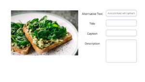
Why Make Images Accessible?

The phrase ‘A picture is worth a thousand words’ expresses how an image can convey something even better than words.  For those who rely on screen readers, descriptions added to the images are needed.

There are several ways to add descriptions to images to make them accessible. The two most popular are alternative text and a long description. The guides below will help you explain an image with text and decipher which option works best for what type of image.

Sample image of adding alt-text or a long description.

Learn more about creating accessible content through our live trainings or other services.

back to top

Making Images Accessible: What Doesn't Work

The following list is comprised of the most common issues that make images inaccessible and quick steps for how to avoid them:

  • Providing images with little to no context; images without context can be difficult to perceive for many users.
    • Instead: create context with captions and titles to better introduce the image
  • Relying on auto generated alternative text; some programs will generate alt-text that is often inaccessible
    • Instead: manually add alternative text to ensure accuracy
  • Having images with Word Wrap (where text wraps around the image); screen readers might read the image in the incorrect place in the text.
    • Instead: Insert images In-Line with Text.
  • Using color as the sole indicator; colors are not perceived in the same way by all and should be supported
    • Instead: use patterns and other visual cues to indicate meaning
  • Including complex images without extended description; images like infographics convey a lot of information that is inaccessible to screen readers
    • Instead: add textual description of the image that conveys entire value of the image
  • Including pixelated images; when images are “stretched” they become pixelated making them more difficult to view.
    • Instead: resize the image in an appropriate program before adding it to the content

back to top

How to write Alt-Text

Writing Alternative Text can seem daunting, but there are some basic things to keep in mind when writing your alt-text for images.

Mindful and Meaningful image use

  1. Determine image value: Do we need this image?
  2. Evaluate context and purpose: Is the image informative or decorative? (Decorative images do not provide contextual value.)
  3. Describe objectively: What is being presented?
    1. Suspend bias and describe the image in relation to the overall context.
    2. Colors, lighting, and other details do not need to be described unless relevant.
    3. People: Avoid assuming gender, race, etc. Always use a person’s preferred descriptors if available. Use visual descriptions such as “dark-skinned” or “light-skinned.” Where necessary for understanding content, gender may be described but no assumptions should be made. For more information, the Museum of Contemporary Art Chicago has a good page on their guidelines for describing art (external link, opens in a new tab).
  4. Be succinct: Can the description fit in two sentences (or about 125-150 characters)?
    1. If more description is needed than can fit in Alt-Text, you might need to append or link to a Long Description document or page.

So keep in mind: Value, Context and Purpose, Objective Presentation, Succinct.

back to top

Dig Deeper with these Additional Resources (external links)

back to top

Connect with the Instructional Accessibility Group

Improve your instructional accessibility through the IAG live trainings, access checks for individual materials, or course reviews.

Have additional questions? Email the Instructional Accessibility Group.